The developers have introduced a new user interface (UI) for the Xbox Series X|S and Xbox One. However, many gamers are complaining about the changes and stating that they are not satisfied. MeinMMO explains what is being criticized.
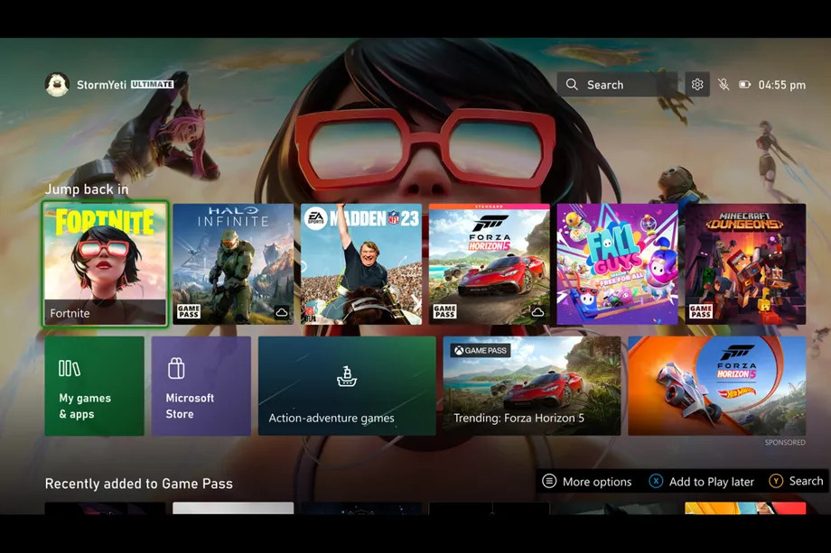
When you start your Xbox Series X, S, or Xbox One, you are first greeted by the console’s menus. This is where you select your games and apps or switch to the store and purchase new products.
Now Microsoft has announced that it wants to revise the Xbox menus. The first insiders have been allowed to use the new interface since September 9. However, many players are not really happy with the changes.

Microsoft presents changes, wants to listen to players
What are these changes? Microsoft is currently distributing a new home interface for Xbox consoles to Xbox insiders. The changes include various optimizations of the layout and design to make it easier to find Xbox games and apps. Additionally, the settings are being adjusted.
In an interview with the online magazine TheVerge, Ivy Krislov, Senior Product Manager Lead of Xbox Experiences, explains that there is still much to learn and they want to approach the users:
We also know that we can always listen and learn how to improve this area without the player experience becoming too fast and familiar. For this reason, we are launching a series of experiments over the course of several months to learn how to create a more personalized home screen experience and fulfill some of the major trends and fan wishes.
Ivy Krislov in an interview with TheVerge
However, the first experiments receive little positive feedback and the reactions are quite negative. Many users hope that Microsoft will truly listen to its insiders and not make various changes.
“It looks extremely cluttered.”
What are the reactions like? There is already an extensive thread on reddit about the new design where many gamers are complaining (via reddit.com). Many find the new design to be even more cluttered than the previous design. For instance, one user complains (via reddit.com):
The store, My games and apps, Gamepass… pretty much everything can be accessed through the Xbox button menu. In my opinion, there is no reason to have 4 different ways to access the same thing. (…) Just give us more creative control over the dashboard.
Another user announces: “My God, this might be the worst version yet. I am in the insider alpha phase, so I will tear it apart for everyone’s benefit.”
What do players wish for? Many Xbox owners primarily want a clearer interface with fewer contents. Another desire is for more personalization for the home screen. They want to be able to decide which content is visible on the “personal” side of the Xbox and which is not.
What do you think? Do you like the new design, or do you also prefer a simplified menu and simpler menu? Let us know in the comments!
8 reasons why you should buy an Xbox Series X instead of a PS5