
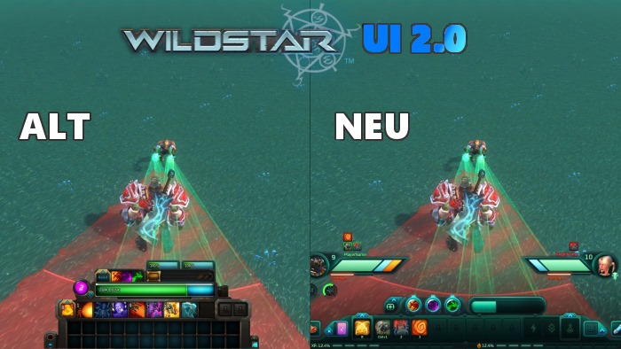
Yesterday, a new detail about WildStar was revealed that many have been waiting for: The interface is finally being revamped!

Until now, the user interface of the MMO hope of 2014 was rather confusing, and especially the lower middle screen used far too much space. Since in WildStar, the player’s character is represented smaller than in other games, this often led to problems, as the feet of one’s avatar frequently disappeared behind the interface, making it difficult to always be sure if one was standing in a dangerous area of effect attack.
Although the new UI is still in beta status and will likely undergo many changes before the game’s release, the important elements are now much clearer and more space-efficient, despite the increased amount of information. The player’s HP and that of the enemy are now closer together, and it is also possible to see the progress of the path experience points without having to laboriously navigate through the menus – which are now also arranged in the lower screen area.
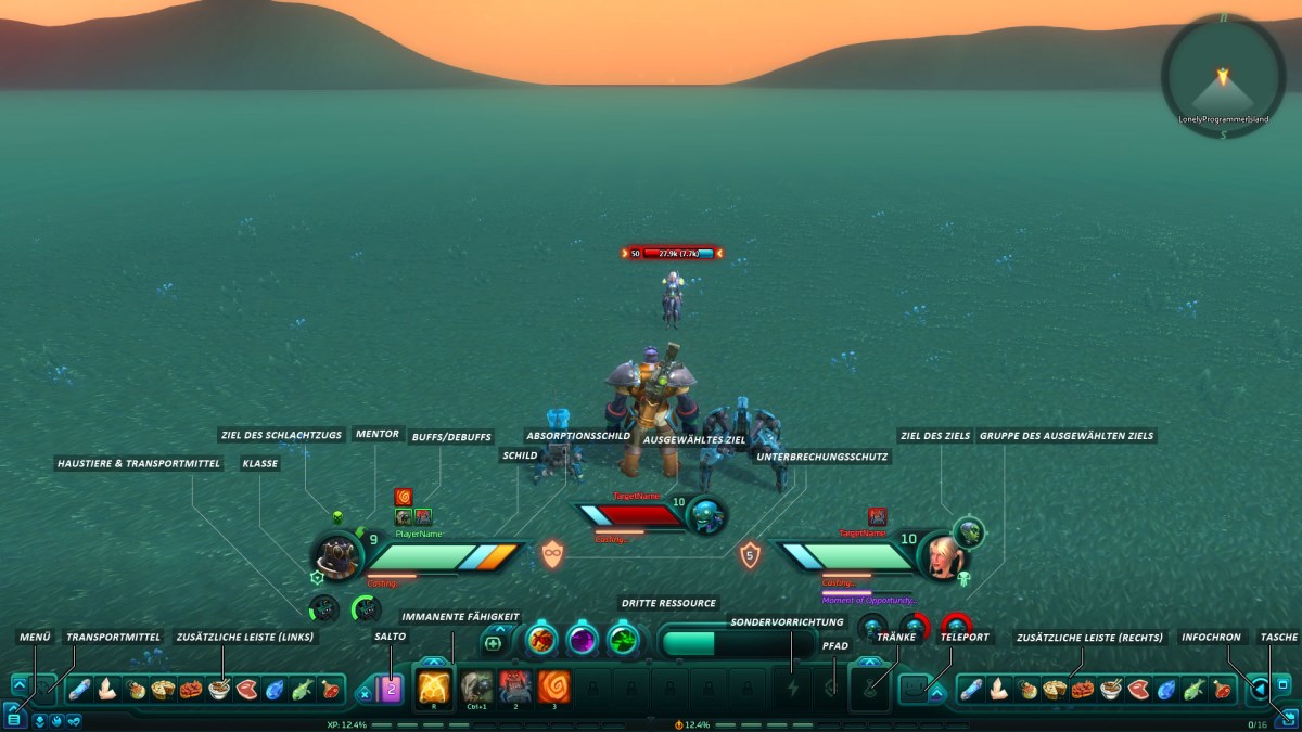
Additionally, the developers have announced that it will be possible to move all elements freely – customization is one of the major buzzwords of WildStar. Particularly interesting is the ability to display certain parts of the user interface only during combat, allowing players to see as much of the world as possible while exploring.
Even more information about these changes can be found here (official WildStar blog).

Your opinion is important to us!
Do you like the article? Then let us know!