Star Trek Online is launching on consoles soon, and the game’s lighting has been revamped. See here how this affects the environments.
Interiors required a lot of work
With the transition to a console version, Star Trek Online needs to be improved a bit to appeal to a larger audience with its graphical style. The lighting of the individual areas is particularly important for this process, as light and shadow make up a significant part of the atmosphere.
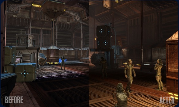
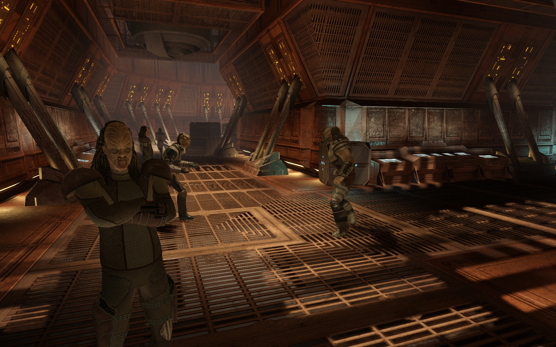
The developers reveal how the lighting system was transitioned. Fundamentally, the entire “Star Trek Online” can be categorized into three different types of areas: space, outdoor areas, and interiors. While space and outdoor areas hardly needed any work and still looked good after the transition, this was not the case for the interiors. Many lights seemed out of place and made the environment look more silly than truly “beautiful”.
A lot had to be redesigned manually to make the game zones look appealing again. The developers also provided a few screenshots with “Before/After” comparisons. Just see for yourselves the effect.

The full article about the lighting, with lots of details from a developer’s life that mere mortals can probably only understand if they beseech 7 computer science students for insight on a full moon night, can be found in our sources.
For more news and articles about the Sci-Fi MMORPG, visit our Star Trek Online game page.