Since the release, there have been numerous discussions around Elden Ring. One of them revolves around the minimalist interface, which is in the tradition of the developer’s earlier games. Some love it, while others express sharp criticism. MeinMMO summarizes the various arguments for you.
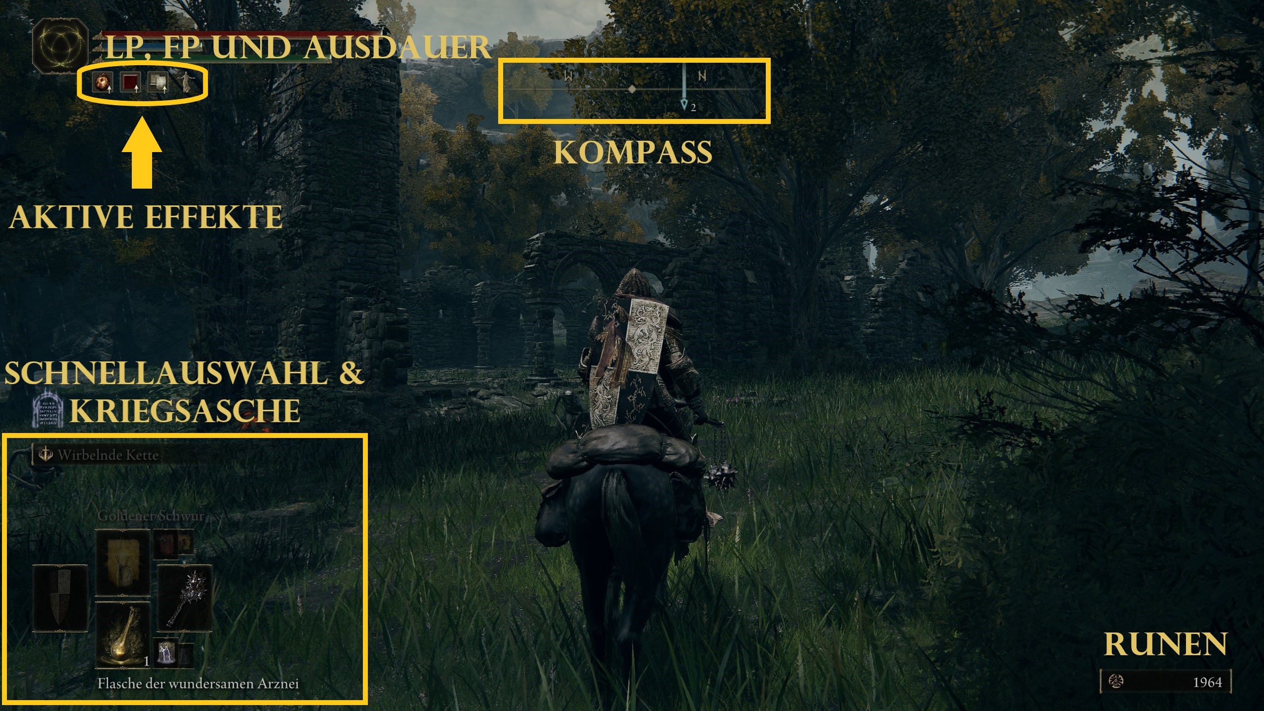
What is the problem with the HUD? Like previous games from FromSoftware, Elden Ring opts for a very minimalist menu and HUD while you traverse the game world.
The game foregoes HUD elements that you would typically find in most open-world games.
- There is no minimap.
- The game has no quest markers or any other indications that provide you with objectives in the HUD.
- There are also no updates on the progress of specific quests, or any summaries of certain events.
- Almost every beginner’s guide includes notes about the HUD, as it isn’t very beginner-friendly.
While part of the community has been accustomed to this minimalism for years, there are also some new players who prefer simplicity.
However, many newcomers playing their first FromSoftware game with Elden Ring find it challenging to deal with the less accessible interface.
The discussion was triggered by a meme in the community. It is an edited screenshot of Elden Ring, showing what it would look like if the game were developed by Ubisoft:
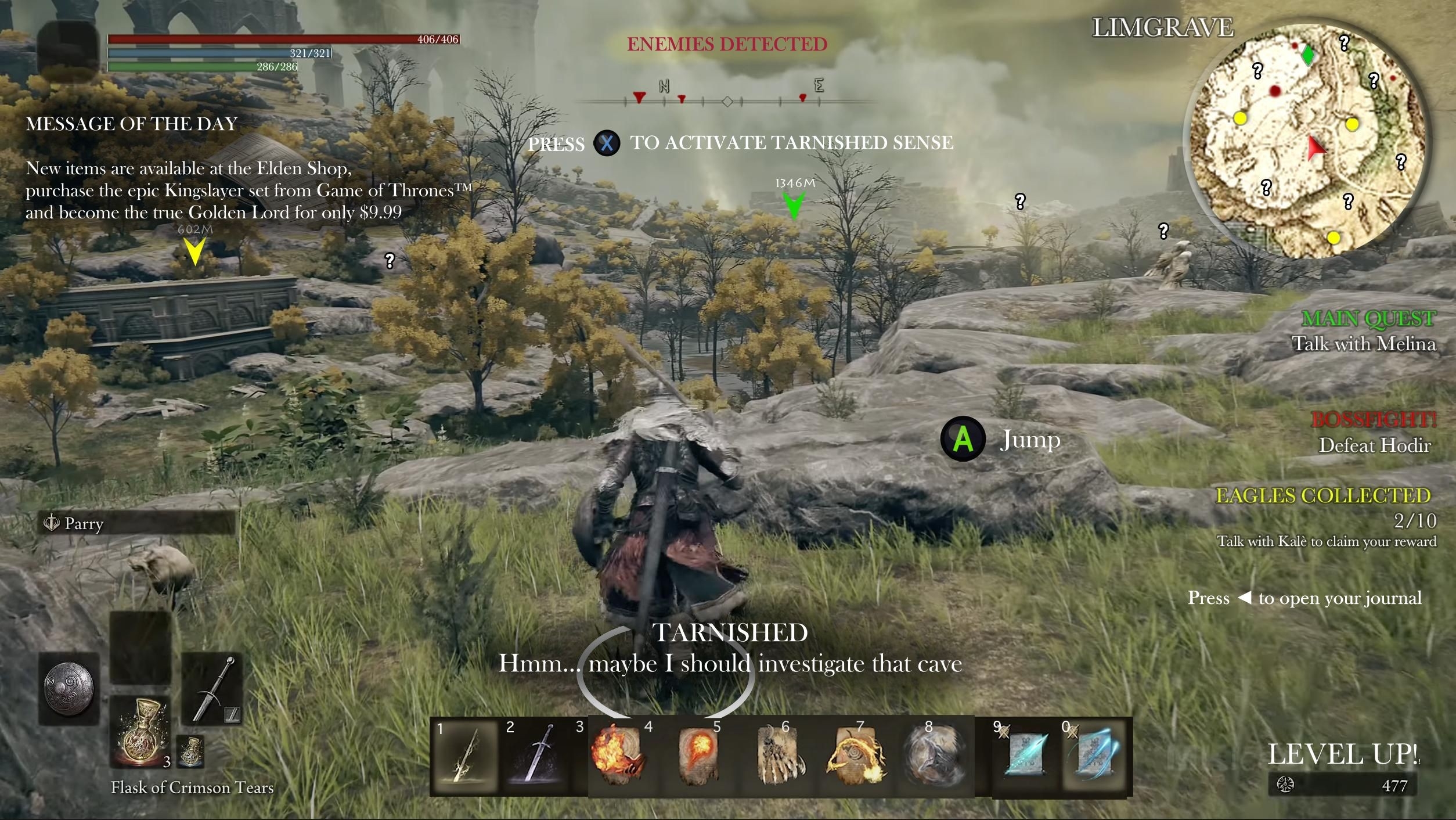
Minimalism or Laziness? The HUD of Elden Ring Polarizes
What exactly is being criticized? There are a few major points of criticism:
- The HUD shows icons indicating which effects, such as buffs or debuffs, are currently active. Many players, for example, were unaware that a warm embrace can actually have negative effects on them.
- The status menu hardly explains what effects correspond to which attributes and what resistances do. The specific weather effects are also not explained.
- The impact of status effects and various other elements are not adequately explained in the eyes of some players.
- PC players, in particular, criticize that the menu is not optimized for mouse and keyboard controls at all.
Often, you have to figure things out for yourself or experiment with specific elements to understand them. Ultimately, this is the crux of the matter, where proponents and opponents of this design philosophy find it difficult to agree.
On reddit, TelefonSquid writes:
Perhaps it’s more of a personal preference, but I hate the FromSoftware interface. It’s clunky, it’s not well-optimized for mouse and keyboard, and it doesn’t communicate information efficiently. If it works at all.
TelefonSquid also criticizes some players from the community who defend FromSoftware: “Some fans in the soulslike community consider themselves ‘hardcore’ and are somewhat proud that they endured the flaws of the games, so others should do so too.”
Even some developers from other studios spoke up, criticizing the high ratings of Elden Ring after its massive success. Some of them believed that a game with such a “bad” interface shouldn’t receive such high ratings, as reported by colleagues from Kotaku. This really got the discussion rolling.
Elden Ring intentionally detracts from player experience due to its less accessible interface. Some even go so far as to speak of sheer laziness.
The criticism was formulated so harshly that there were even accusations that the developers were just envious of Elden Ring’s success.
What supporters say: Besides players who are not bothered by the interface, there are even ardent fans of minimalism. Many of them believe that games are often too easy and overwhelmed with numerous tutorials, menus, and many HUD elements.
Open-world games are often mentioned in this context. Therefore, they find it refreshing when a game doesn’t immediately present everything to you, and the player has to take the initiative to find certain things in the menu or understand the icons in the HUD.
Some argue that FromSoftware has always primarily developed for consoles, and thus PC ports are often left lacking. Perfect_Pause_3578 adds:
They will never make this series as accessible as, for example, Horizon Forbidden West, or truly optimize it for PC. Why? Because it will sell nonetheless. We let them get away with so much because they do something so unique.
Among those who can warm up to the HUD are not only long-time Dark Souls veterans. Even new players can relate to it. For instance, reddit user JEDJED15 writes:
I have never been interested in a FromSoftware game, not even a little bit. […] I’ve been playing for about 10 hours now, just defeated Margit, and I’m exploring the castle, and I must say that this is an incredible game. I have always been a fan of deep RPG mechanics, extensive lore, immersion, minimal to no HUD, and no hand-holding (I turn off HUD, minimaps, and tips in all games), so this game meets all criteria for me.
Many point out that the game provides enough explanations in the HUD. They are just hidden and can be easily overlooked.
This is how you find out what your attributes do: If you want to know, what focus actually is and how it affects your character, you just need to go into your status menu and press the share button on your controller, or “G” on your keyboard.
Then you just have to select “explanations” and can scroll through the individual values and resistances.
But what do you think about the topic? Are you proponents of minimalism? Or do you belong more to the critics? What aspects would you change or improve in the HUD?
The interface is not the only topic of discussion. Balancing has also been a constant topic since the release: Should the strongest weapons & spells be nerfed?