
In Destiny, the lead UI designer David Candland spoke about the development of the menu of Bungie’s MMO shooter.

At the Game Developers Conference in San Francisco, Bungie’s lead UI designer David Candland gave a lecture on design and the interface of Destiny.
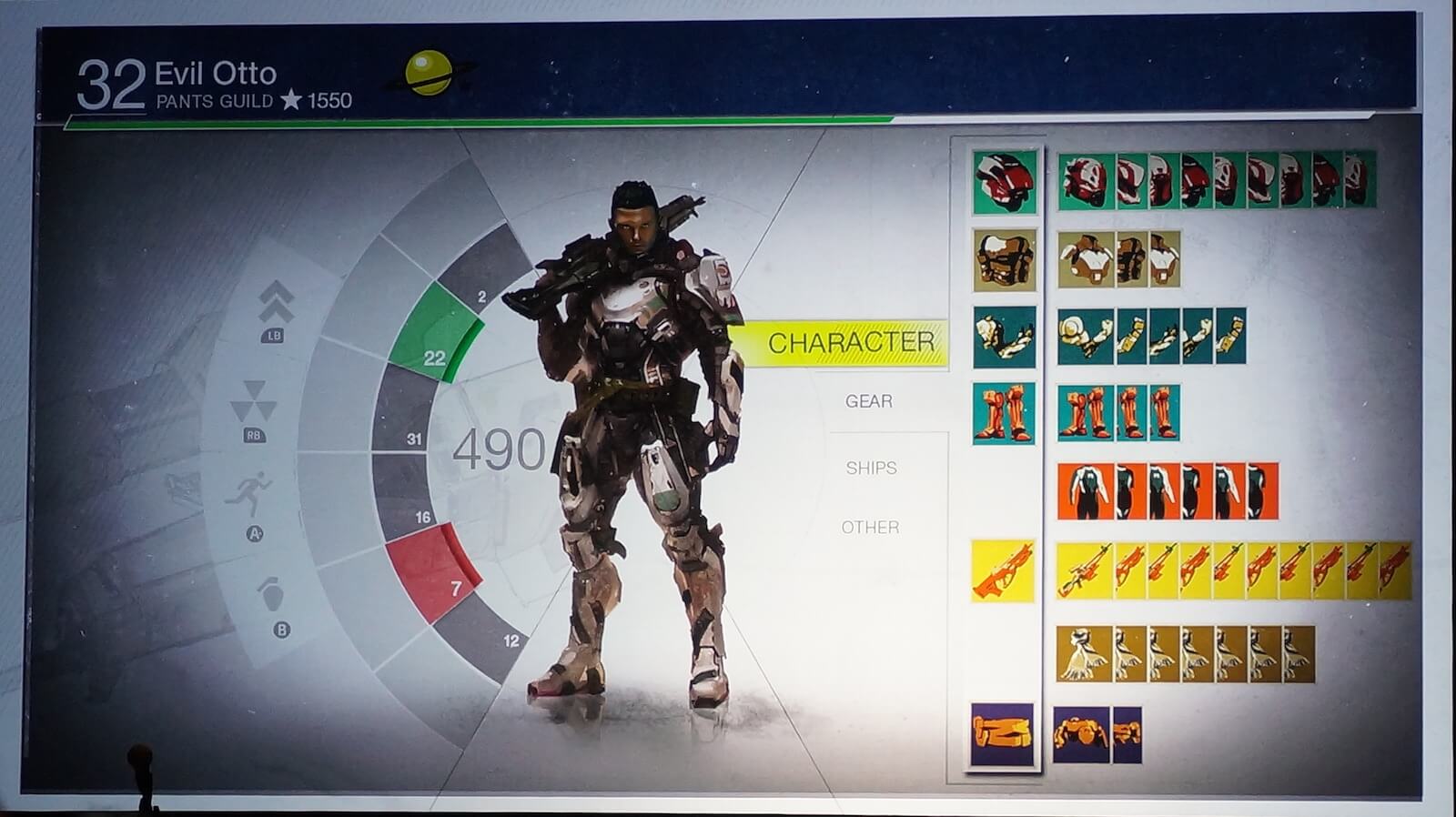
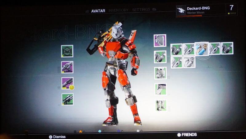
The menu cursor of Destiny was worked on for a long time

While in many console games, you switch from one selected item to another with a button press or a stick movement, in Destiny you have a freely movable cursor available ‒ similar to a mouse on a PC.
According to Candland, it took a lot of time to achieve the cursor’s movement behavior as we know it today. When you hover over the icon of an item, the cursor slows down a bit and the graphic stands out slightly. This slowing down was carefully worked on until the cursor behavior felt right.
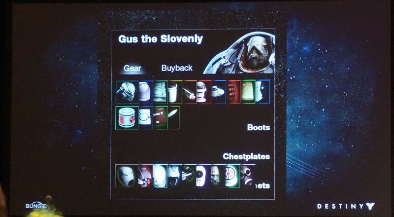
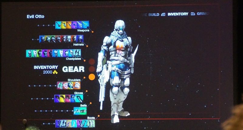
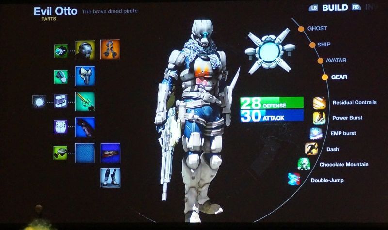
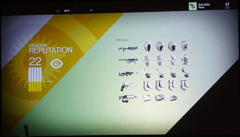
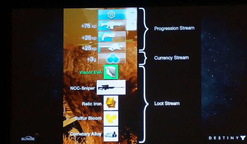
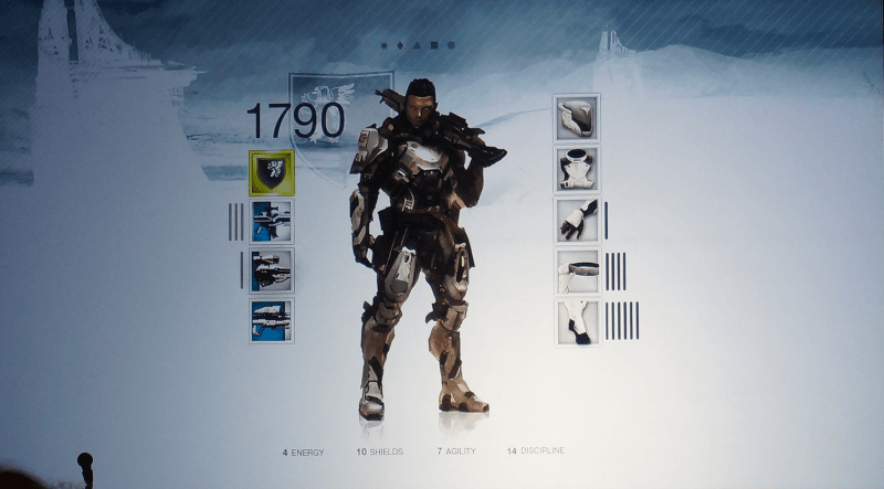
These are early models of the user interface of Destiny
Candland also showed early models of the UI during his presentation, which illustrate how the layout evolved over time. While Candland presented these images, he emphasized that many items and also the text in these models originated from the art team and had no relation to the content that actually made it into the game. Therefore, it is advisable not to read too much into what you will see next.
The order of these images shows (presumably) the evolution of the user interface of Destiny, which ended in the final version, as we know it today:

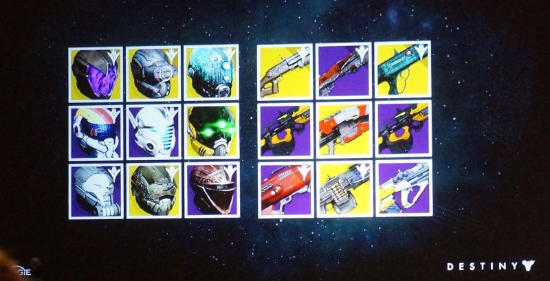
Candland mentioned that a lot of time was also invested in designing the symbols for all equipment pieces. During the presentation, he showed some of these weapon and armor symbols from the final game and bet that many people in the audience would recognize the items just by the symbols. According to Kotaku, he won that bet.
Ttime says: From this talk by Candland, one can take home that it takes a lot of work and time to develop and design a unique user interface for video games that satisfies the customer.
Even though there are currently some complaints about Destiny, I must admit that the developers have succeeded with the interface. I find it not only clear and nicely designed but also easy to use. This menu joins the list of many things that just feel good when you use them in Destiny. Especially the gunplay, that is, handling the weapons, provides an excellent gaming experience in Bungie’s MMO shooter.
What do you think of the development of the UI of Destiny? Are you satisfied with the menu?
The interface models were captured by the US site Kotaku during the lecture with a camera.

Your opinion is important to us!
Do you like the article? Then let us know!